Half Created on my Phone, about my Phone
October 17, 2024
This is technically the same day as the previous post, it's just past midnight so I'm using Thursday instead of Wednesday. Even though the previous post was also written past midnight...
Anyway, I'm using Koder Code Editor from the iOS App Store. For text, this works perfectly fine. Obviously a worse experience than using a keyboard, but it's chill. No idea how I'd do images, so I just won't. I need to pick my battles.
Anyway, this is about iOS now. iOS18 is absolutely abysmal and I cannot believe Apple released it to the public as a stable releass/official update. It's buggier than betas I've used. I love the additions, like the app and home screen customization, and the control center customization is so grest it's the reason I updated.
However, actually using any of it is extremely aggravating and dysfunctional, the actual process of editing anything is completely nonsensical and deranged. You move one thing and everything teleports in what feels like random directions. It's traumazing. Now that I have it set up I actually use the control centee again though. I haven't used it since iOS moved it from swiping up from the bottom to swiping down from the top right.
The actual wigdets in the control center are broken too, the default widgets for toggling white point and color filters will randomly disappear and/or disappear ob a restart. I just added my shortcuts instead. Why add all of these new features if they're not going to WORK? AAAAUGH
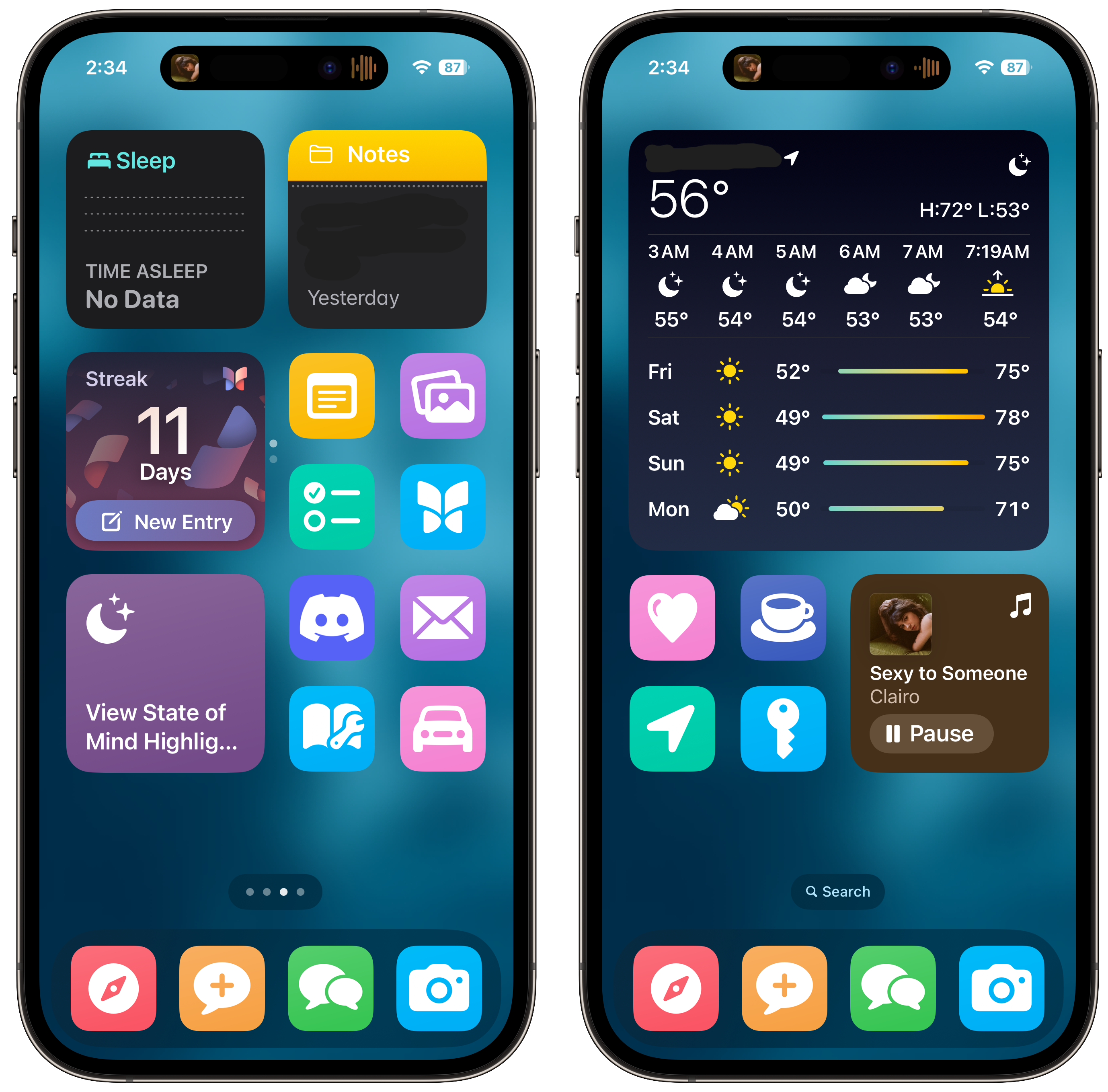
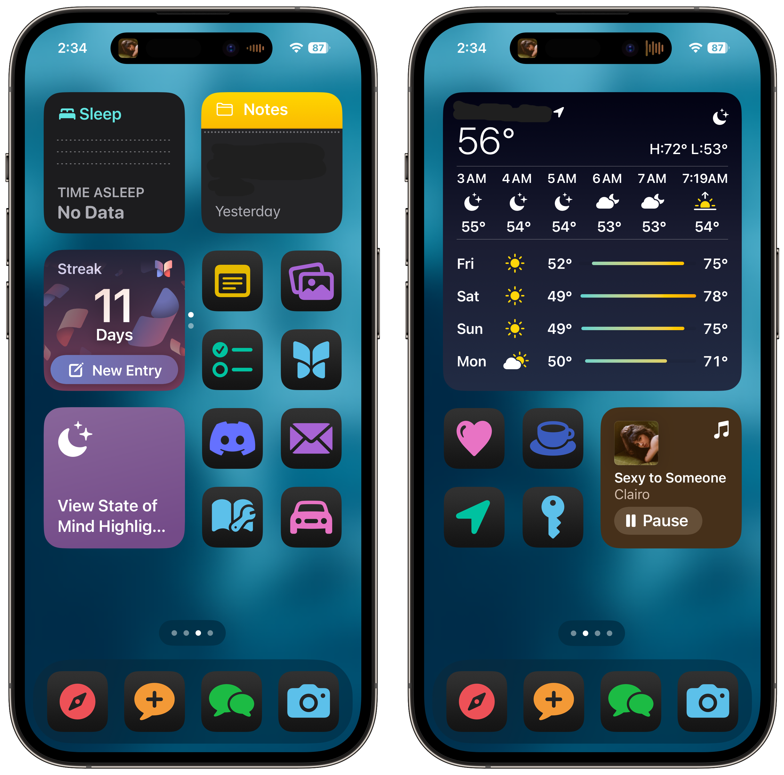
Anyway, here are some photos of my home screen and my control center. I like having light mode and dark mode automatically switch based on the time of day, but light mode never felt like lightmode because some icons are "dark" by default, so I started by replacing those icons with shortcuts that use the default color and icon options, cause those change with the light/dark mode, and after realizing how nice it looked I just changed all of them to match.
(Photos and text hereon added at and after 3:15PM after I went to bed and woke up)
Control Center

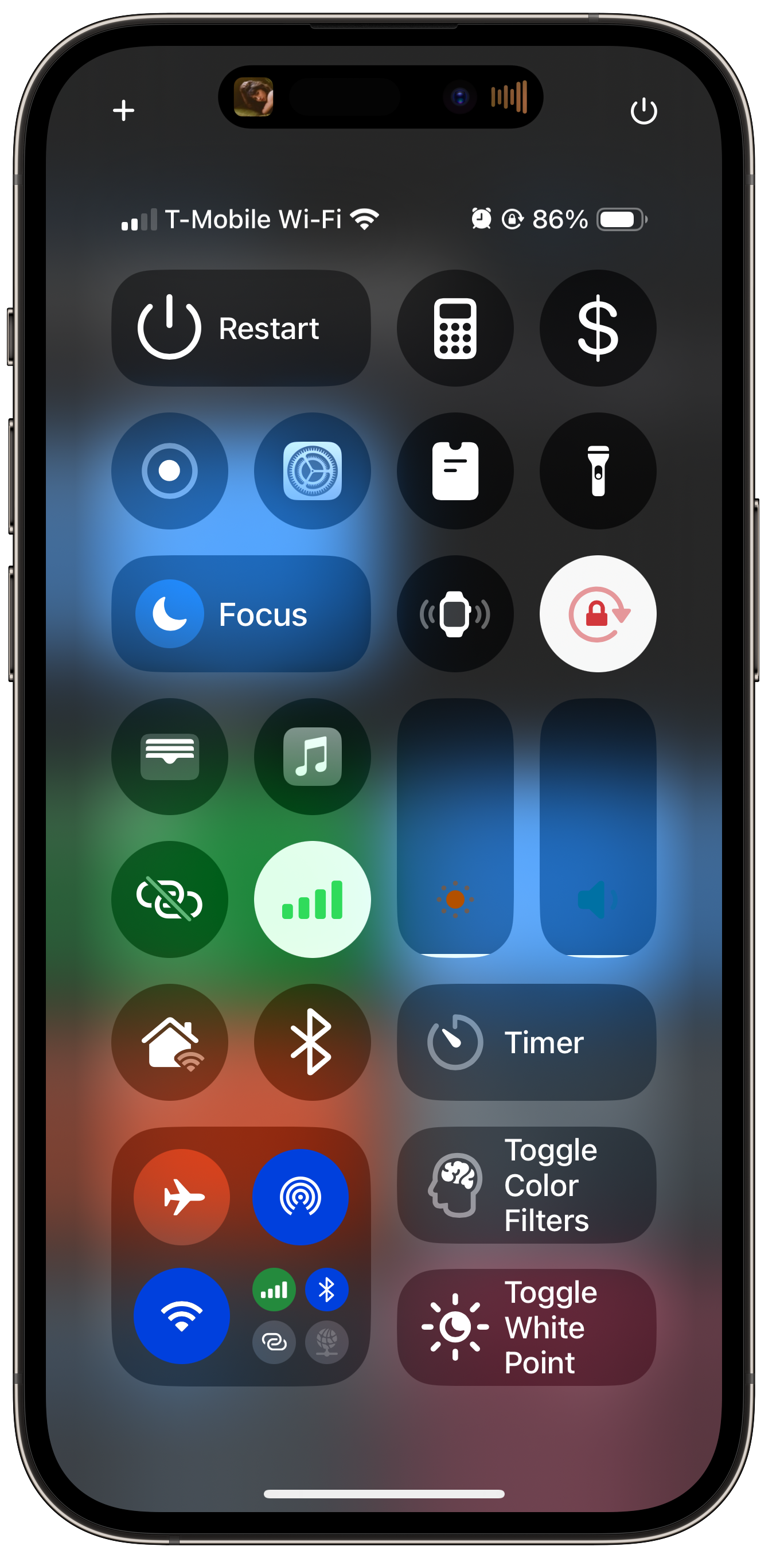
I'm gonna break down each widget in my control center, top left to bottom right, and whether its a default widget or a shortcut.
The Restart button is a shortcut, if you tap it it asks to confirm you want to restart the device. Then it restarts. Pretty basic but very useful.
The next two are the calculator app, which is vanilla, and the cash icon is a tip calculator shortcut. I love my tip calculator shortcut, I am so bad at math (literally need to be tested for dyscalculia) and it's WAY faster than manually calculating the tip. I have this on my lockscreen too.
Next are screen record (vanilla), settings app (open app shortcut), a shortcut to apple pay request money from a contact (I'm usually the friend who puts the bill on my card & is paid back), and flashlight.
Next is focus modes, ping my apple watch, and orientation lock, pretty self explanatory. Next is the wallet app (vanilla) and the music app (open app shortcut), and of course the brightness and volume sliders.
Next are hotspot and celluar (vanilla), followd by shortcuts to toggle Wifi and Bluetooth on and off, there's no way to turn either OFF by default in control center, which drives me crazy. Do you know how often turning something on an off again fixes it? Like, usually!! I use these all the time.
Finally, the connections hub, timer widget, and my last two shortcuts. iOS18 actually does have buttons for turning color filters and white point on and off, but they are so buggy that I don't use them. Both of the vanilla widgets will disappear after a restart, and also seemingly at random. I already had these shortcuts made and used them before I updated anyway, so I just added them here. They're toggles. I have my phone set to black and white and the white point greatly reduced at night, so that's why I use these so much.
You might wonder why I don't have a music widget, that's because I use the dynamic island, and need to open the music app to initally start the song or playlist anyway. I have this one control center page, even though you can have more now and there's three by default, because if there's more than one page I will never use them, and having just the one means I can swipe to close it.
Light Mode/Dark Mode Home Screen

I really like having dark mode switch automatically when it becomes evening, and I have everything enabled that way. The only thing was some icons look like dark mode icons by default, so ligjt mode didn't really feel like "light" mode, more like "original" or "default" mode, so I started changing the app icons that looked dark by default to shortcuts.

I did this by adding a open app shortcut, but instead of changing the icon to a photo like usual, I used the default color and icon options in the add to homescreen menu. If you do this, it will also change to dark mode. After I did this I realized it would look better if they all matched, having some icons be 3D and some be flat didn't cool as cohesive or clean. The only icon that isn't a shortcut is Discord.
These aren't my only two pages, and they're also not in order. The render generated them like this and I didn't wanna fix it. My third page is my first page, and has picture widgets of my boyfriend and my cat, and then a large widget of today's todoist entries. I would've censored nearly everything on that page so I just didn't include it.
Overall, I love the new customization in iOS18 but the bugs are unacceptable. If I was okay with bugs I would've installed the beta. I like how I have this set up, it's made my phone very steamlined and usable. I like the large icons and not having the app title shown, and now that I've customized the control center I actually use it. I will really really love this update once it doesn't bug the fuck out on me constantly.
Thanks for reading!
~Liyah 🐈